 |
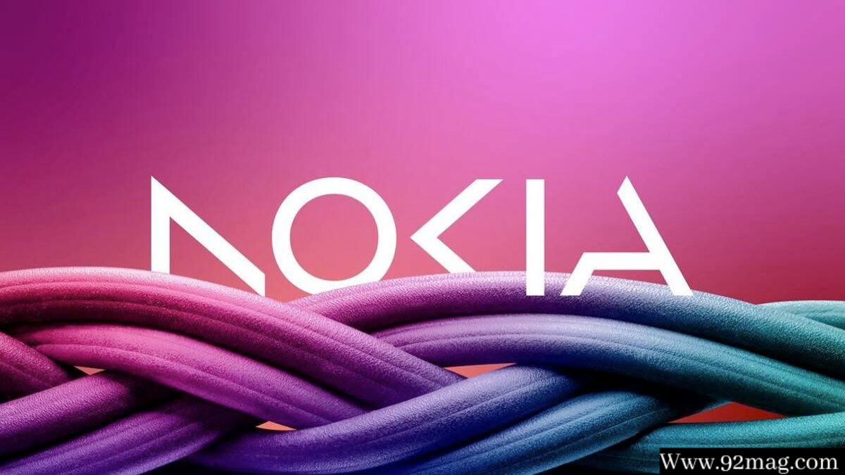
| Nokia has introduced a new brand logo. |
Highlights
- Nokia has introduced a new brand logo for the first time in its 60 years of existence.
- The new logo has five different shapes forming the word "Nokia".
- The iconic blue color has been changed to different new colors based on usage.
For the first time in its 60-year history, Nokia has announced a change in its brand identity with a completely new logo. The new logo has five different shapes forming the word "Nokia". The iconic blue color has been changed to different new colors based on usage.
In an interview with Reuters, CEO Pekka Lundmark said: "It was about smartphones, and today we are a business technology company." Lundmark, after taking the job at the Finnish company in 2020, presented a strategy that includes the mantra "restart, accelerate and scale".
According to the company, the recovery phase is now complete, so Lundmark said phase two is now beginning. Nokia is still looking to expand its service provider business by selling devices to telecom companies. The main focus now is selling devices to other companies.
Nokia wants to take on Microsoft and Amazon by pushing automation and data centers.
According to Lundmark, India is the fastest growing, lower-margin market and this is a structural shift.

0 Comments